{from the last post, I found my super yummy pumpkin bars here - use a big jelly roll pan, that isn't mentioned in the linked recipe} ....ok, now I'm using this new blogger editor and can't get that crazy highlight to go away. so I changed it to a nice, pumpkin color.
I had fun the last couple of days just using my stash!
(It's been a while....I'll have to do an offical update on that this weekend)
I have an owl quilt that was started.

And I'm trying to push myself a bit with some quilty things
so I thought I would try out some purple.
I had literally pulled out the fabrics I wanted to make a huge wonky star, then put them back and pulled out my purples.
Plus some green. I loved the purple and green that Audrie used.

But I got to the point of sewing the nine parts together and wasn't sure! I couldn't tell if it was my purple bias, or it just wasn't right. Usually I'm like - wow I love this thing I just made. Not as much with this one.
So I tested out the birds....
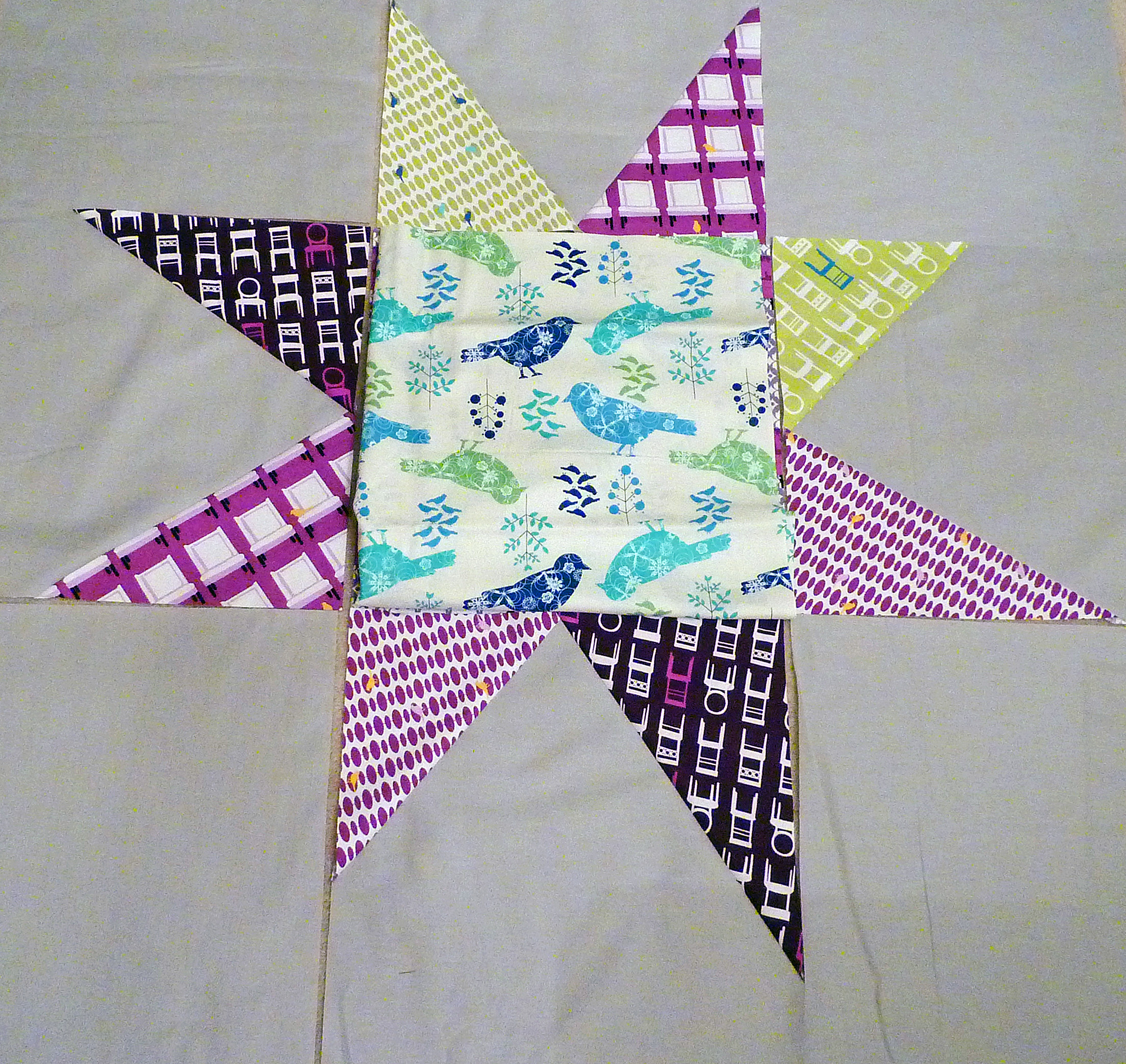
Seeing it posted now, I agree with Julie when I asked for her help - this is totally wrong.
It sure it a challenge working with colors that aren't your favorite.
Fun! (And feel free to offer your thoughts on the purple star)
10 comments:
I think a solid purple might do the trick. Love the bird fabric though!
how big is this star?? it looks great. i like the colors. i don't work with purple, or pink, that much but somehow find myself in the midst of just that...a pink and purple quilt!! yikes!
I like either really. Purple is my signature color though! For you, I would go with the second center choice. Wouldn't want to OD yourself on a color that your not totally comfortable with right off the bat and ruin using purple forever! That would be tragic. hehe Jenn
I really like the purple star and the couch print.
Try not to stress about it though. (And I realize that if someone said that to me, I'd probably answer with How Can I NOT?) Good luck!
I actually like the first star, with the tufted tweets in the middle! The second one is just wrong.... I don't know why, but I don't think it works. But I think if you're not comfortable with either, you should stop. You won't enjoy your quilting, or the finished product! And just FYI, I find that I can get a better idea of what my blocks or quilt look like if I take a pic, then pull it up on my computer. It's weird, but it helps you get some distance and perspective.
I love love this color combo! I'm a sucker for purple though. I agree that the middle of the second star is a little off, but I think you have something with the purple, gray, black and hint of green. And hey, if you don't end up liking it, you can always send it my way ;)
I really like the purple star. Purple has been my colour this year.
i am going to be different and say i love teh bird print better!! but both look great- your purple is my orange, i know i'd just struggle!!
I think you need a purple center, but a less busy print. Not necessarily a solid, but something quieter.
I prefer the second star over the first for sure. The first just seems too busy. I have trouble with purple though too. Although you do have some nice purple fabrics!
Post a Comment